

The Whimsical Workshop
Step into a world of creation and self-discovery at The Whimsical Workshop. Here, tinkerers and creative people of all kinds are guided in developing their skills in arts, fabrication, writing, and more. Perhaps you enjoy cosplay, constantly making costumes to become your favorite characters. Or, you could be more of a fantasy fiction writer, intensely writing a story that you will show the world. Whatever your fantastical talent, you can learn about it here. Stop by and embrace your new skills.
Target Audience: Creative Teens
Values: Creativity, Education, Adventure
Theme: Fantasy
Colors

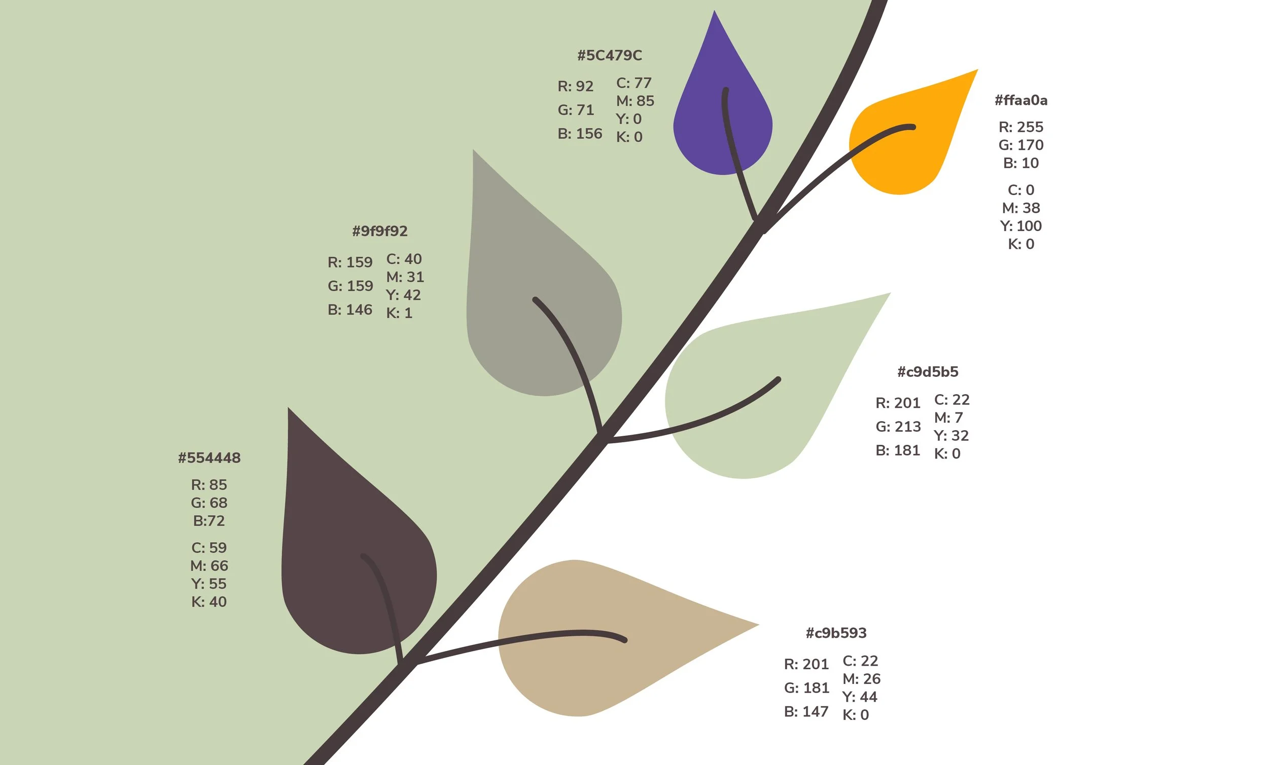
Keeping cosplay, fantasy, and magic in mind, the color palette reflects naturalistic elements with a highlight of inspiration. Purple and gold combine with natural greens and browns to create a magical touch where needed.
Greens and browns: Calm, fantasy
Purple: Creativity, concentration
Gold: Intuitive thinking
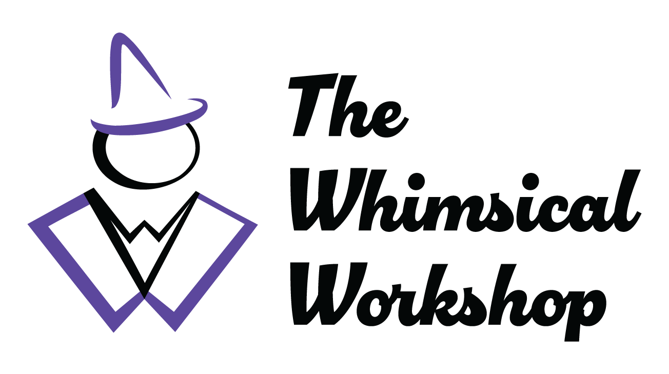
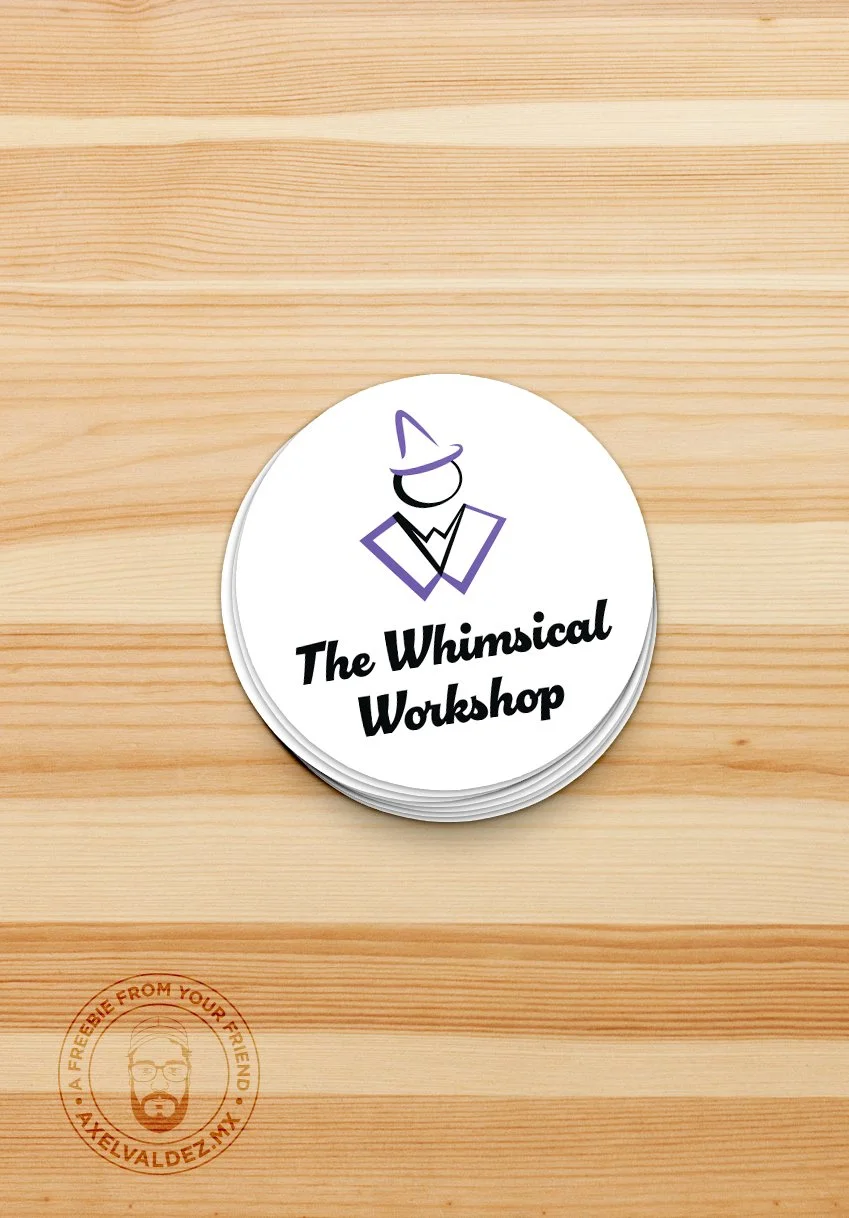
Wizards portray the ideas of whimsy and fantasy. This one in particular is drawn with varying line weights. This hand-drawn feel ties in the creative aspect of the brand. Having a human represented in the logo represents the idea of community, as there would be in a place of learning. This design also subliminally shows the brand’s initials in the lapels of the cloak as well as the collar. They are shaped to look like the letter ‘W.’
Logo
Typography
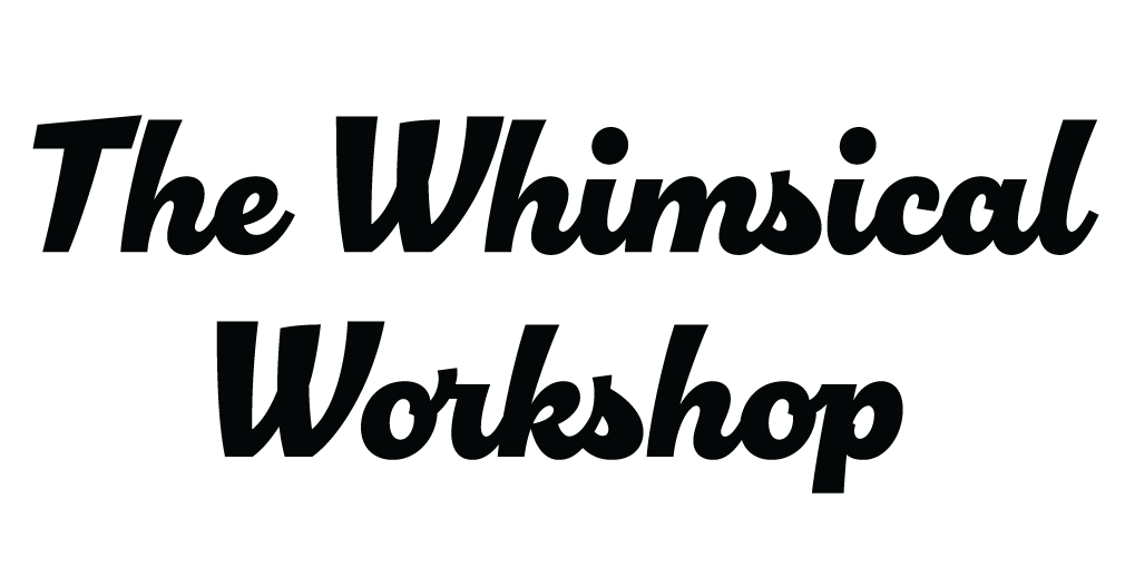
The logotype has a hand drawn feel, yet it is thick and bold enough to make a statement. Hand-drawn letterforms suit the arts and crafts feel of the brand. However, the typeface chosen is not dainty like a quick sketch but powerful like intentional calligraphy. It is round enough to be welcoming yet bold enough to give the name impact. This typeface, Chill Script Regular, is used as the main header for the brand. It is accompanied by Nunito Sans Bold as a subhead and Gibson Book for body copy. The other sans-serif fonts were chosen to contrast hand-drawn text with rectilinear forms.
Photography
Brand photography highlights the experience of creating. Photos may include students working on their projects, their finished works, or instructional materials. The mood is casual and fun. However, images may be themed to specific project moods or holidays to give a customized experience. Feelings of positivity and creativity always remain.


Stationery
All stationery design clearly communicates the brand name while highlighting adventure and creativity. Forest elements, where applicable, provide a sense of mood without crowding the design. The brand pattern is used to inspire fun, especially in places where the forest illustration cannot be applied.
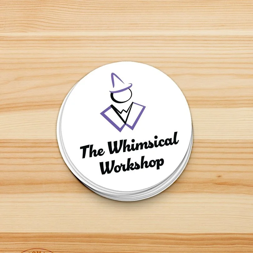
Swag
Branded items are tailored to things needed in the classroom environment as well as the interests of teens. For this age group, stickers would be more used than magnets, for example. One reason is a trend where teenagers display stickers on their laptop covers.

Social Media
Content on social media gets teens interested in the club while showcasing the work of existing members. The tone is bright, optimistic, and relatable. Copy should be casual yet professional. This keeps the friendly feeling for teens while still reminiscent of a learning environment.
Logo Animation 6sec
The brand animations show the logo being drawn with audio to match. The sound was created using a sketchbook and pencil timed to the strokes. The six second animation is more widely used, though the eleven second version is used where time allows.
Logo Animation 11sec
The eleven second logo animation shows each letter being drawn individually. Though it can be too long for video intros and short form content, it is a more interesting visual piece on its own.
Looping Animation
This animation expands the previous concept by adding materials from different disciplines. It is meant to display the different skills that can be learned at the workshop. The audio was recorded in the same manner with pencil strokes on a sketchbook.